
Trading Charts: Types, Components, and How to Read Them
Learn how to read forex trading charts including line, bar, and candlestick types, OHLC data, timeframes, and support/resistance levels.
Key takeaways:
- Trading charts visually display historical price movements over time, though past patterns do not guarantee future price movements or trading success
- Three main types exist: line charts connect closing prices only, bar charts show OHLC data, and candlestick charts provide the most comprehensive price information
- Forex trading charts operate 24 hours across global sessions and display currency pair movements in pips rather than traditional price points
- Candlestick charts, developed by 18th-century Japanese rice trader Munehisa Homma, have become the most widely used chart type across all financial markets
- Trading graph components include price and time axes, with timeframes ranging from tick data to yearly views, though more data does not ensure better trading decisions
- Charts cannot predict unprecedented market events, black swans, or guarantee profitable outcomes regardless of analysis sophistication
Financial markets generate massive data volumes that require organized visual representation. Trading charts transform raw price data into visual patterns that traders analyze for potential opportunities, though these historical displays cannot predict future movements with any certainty.
The New York Stock Exchange now processes 1.2 trillion order messages daily, a threefold increase from just four years ago¹. This data explosion makes trading charts essential for organizing market information, even as the technology's fundamental limitation remains unchanged: charts show only what has happened, not what will happen next.
Understanding Trading Charts
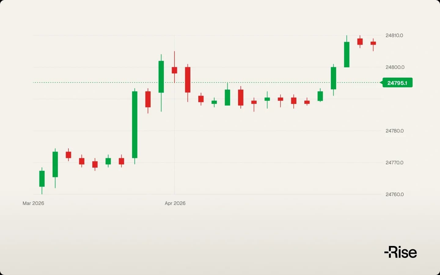
Trading charts are graphical representations displaying how asset prices have moved over time. Scottish political economist William Playfair invented the line chart and bar chart in 1786 when he published "The Commercial and Political Atlas," creating the foundation for modern financial visualization². Today's charts plot price on the vertical y-axis and time on the horizontal x-axis, creating visual maps of market activity across stocks, forex, commodities, and cryptocurrencies.
Every trading period produces four key data points that form chart construction: opening price, closing price, highest price, and lowest price. These OHLC (Open, High, Low, Close) values represent the core information traders analyze, though knowing these numbers provides no guarantee of predicting future movements.
Forex trading charts display unique characteristics due to currency market structure. Currency pairs trade continuously from Sunday evening through Friday evening, eliminating the opening gaps common in stock markets. Prices move in pips (percentage in point) rather than traditional currency values, typically the fourth decimal place for major pairs. A EUR/USD move from 1.1000 to 1.1001 equals one pip, though the monetary impact depends on position size and leverage.
Volume indicators sometimes accompany price data, showing transaction activity levels. High volume may suggest stronger conviction behind price moves, though volume surges occur at both profitable breakouts and devastating reversals. The relationship between volume and price direction remains inconsistent and unpredictable.
Trading Graph Components and Structure
Every trading graph contains two essential axes creating the framework for price visualization. The price axis (y-axis) displays asset values at different levels, while the time axis (x-axis) shows the temporal progression of these values.
Traders select timeframes based on their trading style and objectives. Scalpers might use one-minute charts for rapid trades, day traders often prefer five-minute to hourly charts, swing traders typically analyze daily charts, and investors focus on weekly or monthly views. Shorter timeframes reveal more detail but contain substantial market noise that generates false signals. Longer timeframes filter noise but may hide critical intraday movements.
Each data point on a trading graph represents one complete period of trading activity. A single candlestick on a five-minute chart summarizes all trading within those five minutes. The same price movement appears dramatically different across timeframes, what looks like a major reversal on a one-minute chart might be invisible on a daily chart.
Scale selection affects chart appearance without improving predictive ability. Linear scales show equal price intervals, making them intuitive for most traders. Logarithmic scales display percentage changes more accurately, particularly useful for long-term charts or volatile assets. Neither scale type offers trading advantages.
Three Main Types of Trading Charts
Line Charts
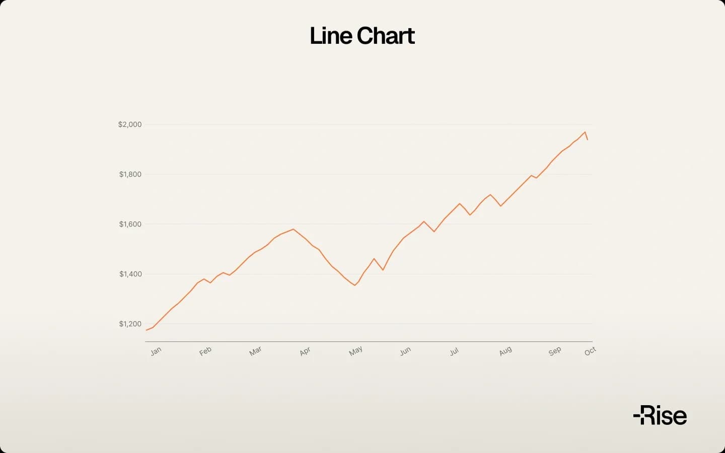
Line charts connect only closing prices with a continuous line, creating the simplest trading chart format. By ignoring opening prices, highs, and lows, line charts present clean trend visualization that some traders prefer for identifying broad market direction.
This simplicity carries significant drawbacks. A line chart forex display might show steady upward movement while hiding violent intraday swings that stopped out numerous traders. Critical information about volatility, market sentiment, and price rejection levels remains invisible. Line charts suit traders seeking general trend direction but provide insufficient detail for precise entry and exit decisions.
Bar Charts
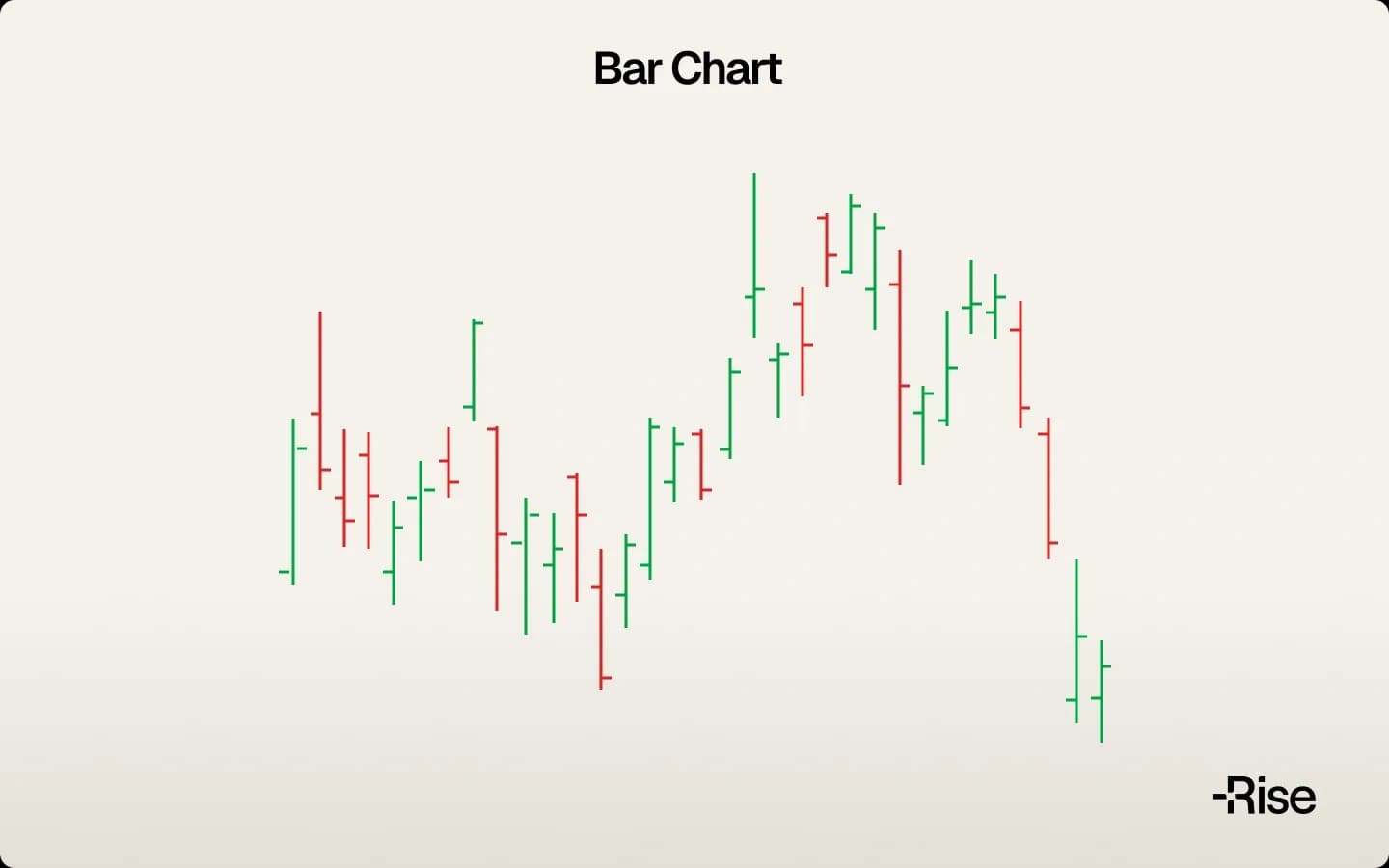
Bar charts evolved to display complete OHLC data for each period. A vertical line connects the high and low prices, with horizontal ticks marking the opening (left) and closing (right) prices. This format reveals the full price range and where the period ended relative to its range.
Bar height indicates volatility, tall bars show wide price swings while short bars suggest consolidation. The relationship between opening and closing prices relative to the range provides insights into session dynamics. A close near the high might indicate buying strength, though the next bar could easily reverse that sentiment.
Reading bar patterns requires practice and remains subjective. Expanding bars might signal increasing volatility and potential breakouts, or they could warn of unstable conditions. Contracting bars could precede explosive moves or indicate dying interest. No pattern guarantees specific outcomes.
Candlestick Charts
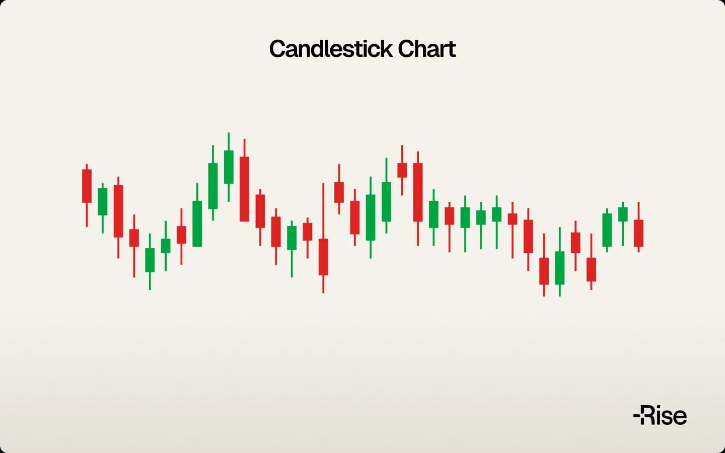
Candlestick charts dominate modern trading charts due to their visual clarity and information density. Japanese rice trader Munehisa Homma developed this method in the 1700s while trading at the Dojima Rice Exchange in Osaka. His 1755 book "The Fountain of Gold - The Three Monkey Record of Money" documented patterns that evolved into today's candlestick analysis³.
Each candlestick's "real body" shows the opening-to-closing range, while "wicks" or "shadows" extend to the high and low prices. Color coding provides instant sentiment recognition, green or white for bullish periods where closing exceeded opening, red or black for bearish periods where opening exceeded closing.
Candlestick patterns form the basis of numerous trading strategies. A "doji" with nearly equal opening and closing prices might signal indecision. A long upper wick could indicate price rejection at higher levels. Multiple candlesticks create complex patterns like "head and shoulders" or "double bottoms" that traders interpret as potential reversal signals.
Despite their popularity, candlestick patterns offer no predictive certainty. The same pattern succeeds in one instance and fails in another. Market context, volume, and countless external factors influence whether patterns play out as expected. Many traders combine candlestick analysis with other tools, though additional complexity does not ensure better results.
How to Read Forex Trading Charts
Forex trading charts require understanding both mechanical components and interpretive elements. While charts display objective price data, reading them involves subjective analysis where experienced traders often reach opposite conclusions from identical information.
Candlestick body size indicates price movement strength within the period. Large bodies suggest decisive movement, though they don't predict continuation. Small bodies might indicate consolidation, indecision, or simply low volatility. The position of the body within the total range (including wicks) shows whether bulls or bears controlled the session's end.
Wick analysis adds complexity to interpretation. Long upper wicks show prices reached higher but couldn't hold, possibly indicating resistance. Yet the same formation might represent normal profit-taking in a healthy uptrend. Long lower wicks suggest buying support emerged at lower levels, though they could equally show the start of distribution.
Timeframe selection dramatically impacts forex trading graph appearance and interpretation. A bearish reversal pattern on a 15-minute chart might be completely invisible on a daily chart. Conversely, a clear daily uptrend could contain dozens of bearish patterns on shorter timeframes that trapped intraday traders.
Currency pairs exhibit different characteristics requiring adjusted interpretation. Major pairs like EUR/USD typically show smoother price action with reliable patterns. Exotic pairs display erratic movements where traditional patterns fail more frequently. Correlation between pairs adds another layer, USD strength affects all USD pairs simultaneously, making isolated chart analysis potentially misleading.
Support and Resistance on Trading Graphs
Support and resistance levels represent price areas where historical buying or selling activity has occurred, although these levels are psychological constructs rather than market laws. Traders identify these levels on trading graphs using various methods; however, no approach guarantees that the levels will hold.
Support theoretically acts as a price floor where declining markets find buyers. When prices approach previous lows, some traders anticipate bounces and enter long positions. This becomes self-fulfilling when enough traders act similarly. However, support levels break regularly, often accelerating declines as stop-losses are triggered below failed support levels.
Resistance represents ceiling levels where advancing prices historically met sellers. Traders might sell or short at resistance, expecting rejection. Yet resistance levels break during strong trends, and former resistance often becomes support after successful breakouts, a phenomenon called "role reversal" that works until it doesn't.
The subjective nature of support and resistance creates conflicting interpretations. One trader's strong support might be another's minor level. Round numbers like 1.1000 in EUR/USD attract attention regardless of technical significance. News events and fundamental changes override technical levels without warning.
Volume supposedly confirms support and resistance strength, with high volume at levels indicating conviction. However, low-volume breakouts succeed regularly, while high-volume tests sometimes fail spectacularly. The relationship between volume and level reliability remains inconsistent and unpredictable.
Forex Trading Graph Specifications
Forex trading graph characteristics differ substantially from other markets, creating unique considerations for currency traders. The 24-hour market structure eliminates most gaps but creates session-based patterns as liquidity shifts between Asian, European, and American trading hours.
Currency pairs quote in standardized formats showing base currency against quote currency. EUR/USD = 1.1000 means one euro equals 1.1000 US dollars. Price movements measure in pips, with most pairs quoted to four decimal places (Japanese yen pairs use two). The monetary value of pip movements depends on position size and account currency, not just the chart pattern.
Spread, the difference between bid and ask prices, affects all forex trades but rarely appears on standard charts. During major news releases or low-liquidity periods, spreads can widen dramatically, triggering stop-losses even without actual price movement to those levels. This hidden cost means profitable chart patterns can still produce losing trades.
Leverage amplifies both profits and losses in forex trading. A small chart movement might represent significant monetary change depending on leverage used. A 1% adverse move with 100:1 leverage eliminates the entire position, regardless of chart analysis quality or pattern reliability.
Session overlaps create predictable volatility patterns on forex trading charts. London-New York overlap typically shows highest volatility, while Asian sessions often display range-bound movement. However, unexpected news or central bank actions can disrupt these patterns instantly, making session-based strategies unreliable.
Common Mistakes and Limitations
Trading charts contain inherent limitations that contribute to trading losses regardless of expertise level. Understanding these constraints might reduce errors, though it cannot eliminate risk or guarantee profitability.
Analysis Paralysis | Traders add endless indicators seeking perfect confirmation. More information often creates confusion rather than clarity. Simple chart reading frequently outperforms complex analysis, though neither approach ensures success. The search for the "perfect" setup causes missed opportunities and emotional frustration. |
Pattern Recognition Bias | Traders see formations that don't exist or ignore contradicting evidence. The human brain excels at finding patterns even in random data, creating false confidence. Confirmation bias exacerbates this, as traders tend to emphasize supporting evidence while dismissing contradictory signals. |
Overreliance on Technical Analysis | Overlooking fundamental factors that drive major market movements. Perfect chart patterns fail instantly when central banks intervene, economic data surprises, or geopolitical events occur. Charts cannot predict these events and offer no protection against them. |
Technology Failures | Platform crashes, data feed errors, and connectivity problems can prevent trade execution or provide false signals. A momentary spike in data might trigger stop-losses that wouldn't normally activate, causing real losses due to technical glitches. |
Black Swan Events | Unprecedented market movements demonstrate ultimate chart limitations. The 2015 Swiss Franc surge, various flash crashes, and pandemic-driven volatility moved markets beyond any chart-predicted ranges. Stop-losses failed to execute at intended prices, causing losses far exceeding planned risk. No amount of chart analysis prepares for unprecedented events. |
Conclusion
Trading charts have evolved from William Playfair's hand-drawn economic graphs to sophisticated digital platforms processing trillions of daily transactions. Modern forex trading charts display vast amounts of information across multiple timeframes simultaneously. Yet technological advancement hasn't changed the fundamental truth: charts show history, not the future.
Line, bar, and candlestick charts each serve different purposes, with candlesticks dominating modern trading due to their visual richness and clarity. Munehisa Homma's 18th-century innovation remains the standard for price visualization, though his trading success came from factors beyond chart patterns alone.
Understanding chart components, timeframes, and patterns provides a framework for market analysis. Support and resistance levels, candlestick formations, and technical indicators offer structure to price interpretation. However, all these tools rely on subjective analysis, where different traders draw opposite conclusions from the same data.
Trading graphs effectively organize market information, but they cannot overcome their inherent limitations. Past patterns fail regularly, unprecedented events occur without warning, and the most beautiful chart setup can produce devastating losses. Risk management, position sizing, and emotional discipline matter more than chart-reading skills.
Success in trading requires accepting that charts are tools, not crystal balls. They display what happened, suggest what might happen, but never guarantee what will happen. Every trade carries risk, regardless of the quality of chart analysis, pattern clarity, or historical reliability. The market's future remains unknowable, making every chart-based decision a probability bet rather than a certainty.
Frequently Asked Questions
Sources:
- Martin, Lynn, "AI trading is flooding Wall Street, and fueling a 1.2 trillion-message trading surge," Fortune, October 15, 2025. https://fortune.com/2025/10/15/ai-trading-flooding-wall-street-nyse-president-lynn-martin-1-2-trillion-messages/
- Spence, Ian and Howard Wainer, "William Playfair and His Graphical Inventions," Journal of the Royal Statistical Society, 2005. https://www.tandfonline.com/doi/pdf/10.1198/000313005X54216
- "Honma Munehisa," Wikipedia. https://en.wikipedia.org/wiki/Honma_Munehisa
Trading guides have been prepared by INGOT SC Ltd., for educational purposes only. This information is general in nature and should not be considered as personal recommendations.
Trading guides does not constitute personal advice and does not take into account your objectives, financial situation, or needs. You should carefully consider whether trading complex leveraged products, such as Contracts for Difference (CFDs), is appropriate for you given your circumstances.
CFDs are complex, leveraged products that carry a high risk of loss. The majority of retail investor accounts lose money when trading CFDs. You should ensure you understand how CFDs work and assess whether you can afford to take the high risk of losing your funds. If you are uncertain whether these products are suitable for you, consider obtaining independent financial advice before trading.
Any examples, patterns, or strategies discussed in this guide are based on historical data and market theory. Past performance is not a reliable indicator of future results. Market conditions can change rapidly, and technical patterns may fail without warning.

Learn how to trade Doji candlesticks: the three types, their success rates, and how to confirm reversals with volume and proper risk management.
Read more
Risk management in trading protects your capital. Learn the 1-2% rule, stop-losses, and position sizing to limit losses and trade profitably.
Read more
Learn to read Japanese candlesticks, decode market psychology, and spot high-probability reversal patterns for smarter trading decisions.
Read more